Data Visualization + Analytics Platform
Powerful, real-time data visualization that deliver actionable insights.
We integrate all your data sources, create data visualizations + deliver accurate data analytics users need. Explore real-time data, uncover optimisations + make operational changes, instantly.
Improve insights + how you use your data with real-time data visualizations.
Our Rayven Platform’s data visualization capabilities empower you to turn raw data into actionable insights, instantly.
We can integrate all your data sources and technologies, allowing you to create custom dashboards that reflect up-to-the-moment information. Featuring an intuitive, drag-and-drop interface, 40+ interactive widgets + AI-based conversational analytics; Rayven makes it easy to build powerful, engaging dashboards + reports that drive better outcomes.


User-Friendly with Extensive Widgets.
We utilise 40+ ready-to-go data visualizations and you can adjust them using drag-and-drop.
Real-Time Integration + Visualization.
Rayven enables us to connect, combine + visualize data from all your existing systems in real-time via easy connectors.
Advanced Analytics + AI Integration.
Rayven supports predictive + conversational analytics, enabling users to uncover hidden trends + insights, simply.
Customisable Alerts + Reporting.
Set thresholds, trigger alerts + generate dynamic, accurate reports in a single click that improve decision-making.
Eliminate the need for multiple data tools: build custom interactive visualizations, predictive insights + AI guidance.
Rayven gives us all the tools needed to design brilliant, custom UIs + UXs that simplify data exploration for users using interactive dashboards + AI-informed conversational analytics interfaces, helping them explore enriched, real-time data easily.
Custom Dashboards +
Data Visualizations.
We can configure different dashboards for individual user types based on your goals and needs, giving each user an interactive pane with both the micro + macro view that they drill-down into and explore.
With 40+ ready-to-deploy widgets + a drag-and-drop configuration interface, our platform makes it fast to build highly-customised dashboards that put BI tools to shame.

(Just some) of our platform's data visualization widgets include:
- Value: alphanumeric value display
- Multi-value: multiple alphanumeric values displayed in one widget
- Alert: conditional display of alphanumeric
message and coloured background - Monitor: alphanumeric value display with range-dependant colour coding
- Gauge: gauge display with range-dependant colour coding
- Percentage: bar or column display with range-dependant colour coding
- Level: display a tank icon with actual and percent fill with range-dependant colour coding
- Tabular data: tabular display of multiple fields
- Raw data: tabular display of multiple fields showing full history
- Pie: showing proportions by device or by field
- Line: time series line chart with or without comparison and target lines
- Bar: time series bar chart with or without comparison and target lines
- Pareto: configurable for frequency or sum of events
- Cartesian: dot plot with configurable quadrants
- Multi-axis: showing multiple variables as lines and or columns
- Forecasting: line chart with forecasting models and projected results
- Control: I-MR control chart with Nelson Rules
- Polar: display the distribution of vector over a period of time
- Category bar: configure and display data using fixed categories on the x-axis
- Map: with configurable highlighting, geofencing, tracking, proximity and drill down
- Overlay Map: put on top of maps custom data.
- Sound: monitor readings in real-time
- Images: display a static image
- Live video stream: display a live video stream

Conversational Analytics: ask questions, get insights + much more.
We can put a GenAI interface on your dashboards, enabling people to interrogate all your data in real-time to uncover new insights, simply.
Train LLMs to give them context + add historical data sets; this transformative technology gives users all-new capabilities to ask what's happening, how to improve, and more.
Learn more about Rayven's Generative AI and / or Predictive Analytics capabilities.
Create + trigger real-time alerts, simply.
We use our platform's workflow builder to create rules, set thresholds + trigger alerts based on your data or predictive analytics.
Rayven's alerting functionality enables react quickly, alert people to problems, or even to flag optimisations in the moment.
Learn more about Rayven's Alerts + Custom Notifications capabilities.
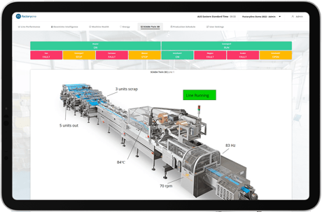
Report with complete accuracy in one-click.
The reporting burden is very real for many businesses, so Rayven makes it possible to create complete performance reports at-will via a click of a button or via regularly scheduled reports.
Our platform, and the solutions built on it, can decimate the reporting burden and make proving compliance simple.
Learn more about Rayven's Dynamic Reporting capabilities.
Rayven + Data Visualization FAQs:
Data visualization is the process of representing data in graphical formats like charts, graphs + dashboards, making complex information easier to understand and act upon.
Visualizing data is essential for businesses, as it allows decision-makers to quickly identify trends, patterns, and outliers, supporting faster, data-driven decisions. Good data visualization turns raw numbers into visual insights, enabling teams to make strategic choices with confidence.
Rayven integrates with various data sources to enable real-time data processing + visualization. This means dashboards update instantly as data flows in, giving teams an accurate, live view of operations.
Real-time visualization is critical for monitoring performance and responding to changes immediately, helping businesses stay agile and informed.
Rayven is able to combine, transform, manage + analyse data from any data source.
This means Rayven can integrate and visualize data from virtually any source (and push that data anywhere, including to existing BI tools), making it an adaptable solution for businesses with complex data environments.
No, Rayven’s comprehensive data visualization platform can fully replace your existing BI tool by providing real-time, customisable dashboards, predictive analytics + integrated data management - all in one place.
Rayven consolidates data from all sources, including those that traditional BI tools may struggle to access + transforms it for immediate analysis and visualization.
HOWEVER, if you prefer to keep using your current BI tool, Rayven can integrate with it seamlessly, providing enriched, real-time data from diverse sources. This means Rayven can serve as a powerful data engine, ensuring that even previously inaccessible data streams are fully available within your existing BI tool, helping you maximise the value of your current setup.
Yes, Rayven features advanced analytics + AI capabilities, enabling predictive and conversational insights within dashboards.
This helps users go beyond current data, uncovering trends and forecasting outcomes, which supports more proactive, strategic decision-making.
Yes, Rayven allows users to set custom thresholds + triggers that activate real-time alerts across multiple channels.
These alerts ensure that key team members are notified immediately of any critical changes, helping prevent issues before they escalate and enabling prompt responses.
Explore Rayven's alerts + custom notifications capabilities.
Rayven’s visualization tools are highly customisable.
Users can choose from 40+ widgets, adjust settings + design dashboards that suit their unique operational needs. Additionally, Rayven supports multi-user views and user roles, enabling tailored experiences for different roles within the organisation.
Yes, Rayven provides fully interactive data visualizations that allow users to click, explore + drill-down into specific data sets.
With Rayven’s platform, you can dive deeper into the data behind each chart or graph, uncovering insights at a granular level. This interactivity helps teams investigate trends, identify root causes + explore relationships within the data in real time; supporting more informed, detailed analysis.
The ability to click through and navigate data layers makes Rayven ideal for users who need a flexible, hands-on approach to data exploration + insight generation.

